POSTS
Still Life - Crocks and Fruit
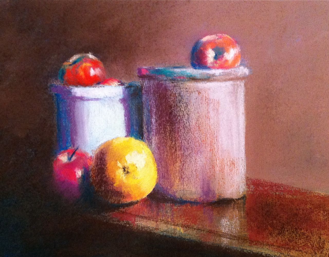
Painted from a photo reference found on WetCanvas.com. I’m really happy with the darks on this one. Vandyke brown and Phthalo blue do a nice job of making something close to black. I’m less happy with some of the shadow colors; they’re a bit intense and could probably stand a little toning-down. I think this would also help the color of the fruit pop a little more.
This is my first painting on Ingres paper. I was skeptical when I started, because it is similar in texture to Sennelier that was basically junk. To my surprise, it took multiple layers of pastel fairly well and and even held up to an alcohol wash.
I’m still struggling with reds, but of all the problems I see with this painting (including a fairly fundamental flaw in perspective), the apples are the least of my concerns.