POSTS
Chandelier
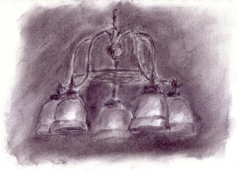
We recently replaced our dining room chandelier. I like the shape of it and have been wanting to draw it for a while. And since I’ve been playing with charcoal recently, I wondered what it would be like to draw it with charcoal.
As with most of the stuff I’ve done with charcoal, there are parts that I like and parts that I don’t.
Starting with the stuff I like… I think I’ve captured the overall feel of the chandelier: the general shape is there; basic pattern of light and dark. I like the dark on dark of the drawing. And I think I did an OK job pushing the rear lights into the background.
Now onto the “not so great” stuff: the lines lack any sort of sympathy for the subject. Instead of modeling the shape of the light domes and relying on form and shadow to create separation, they’re mostly separated by lines. There are a few too many spots where the lines meet the background which lack any degree of blending whatsoever. There is an overly dark spot in my background below the lights on the right of the picture. And I should have put a little more contrast between the background and the light domes — they’re dim, but they’re not THAT dim.
I was shooting for a soft, ethereal feel to the image, and I’m just not sure I achieved that. But for those of you wondering, I actually DID use my kneaded eraser in this drawing to pull out the highlights in the light globes.
Charcoal is a difficult medium to gain any degree of control over. But I will continue to work on it until I feel it’s time to move on to something else.